-

Inter(play) : Puppy Love by local sculptor Francois van Reenen, from the Salon91 contemporary art collection, again alludes to the park theme and adds a playful element to the reception desk. -
Inter(play) : Interior designer Claudia Ongaro's interpretation of the creative brief and careful spatial planning has resulted in a cohesive yet visually interesting space that inspires the people who work for Coley Porter Bell. -
Inter(play) : The multi-coloured Flower Ball by Heath Nash dominates the triple-volume and adds a colour injection into the gallery-like space. -
Inter(play) : Rust against sleek white flooring — the interplay between materials is a key feature of this office space. -
Inter(play) : It's anything but a dog's life at the new Coley Porter Bell offices — Big White Dog by Francois van Reenen enjoys the view from the AstroTurf balcony. -
Inter(play) : Justin Patrick's photograph captures the interplay between white epoxy flooring and Philippe Stark Toy chairs against industrial concrete and brick. The girl with a balloon, by Gabrielle Hope, was inspired by legendary British graffiti artist, Banksy. -
Inter(play) : The boardroom is also referred to as "the kitchen" because of the homey feeling created by the long wooden table, which contrasts with the sleek Panton chairs.


PHOTOS: Ulrich Knoblauch | PRODUCTION: Sumien Brink | WORDS: Alma Viviers
London-based agency, Coley Porter Bell, has brought its unique take on beauty to Cape Town. Interior designer, Claudia Ongaro, was tasked with translating its design philosophy into a playful office.
“Beauty has depth; beauty is truth – it is not superficial or merely pretty,” says Tabatha King, MD of Coley Porter Bell, South Africa.
The agency’s office in Woodstock is more than simply an attractive space filled with beautiful objects. It embodies the truth and depth of beauty, and can best be described as a subtle interplay between old and new, glossy, contemporary design and industrial grittiness, London and South Africa, and white and colour.
The new building by Otten and Louw Architects is located beside Woodstock’s landmark Old Castle Brewery. After seeing numerous commercial developments, The Studios was the first place that got Tabatha really excited when she saw it for the first time, even though it was still a rubble-strewn construction site. “The building was designed with integrity, staying true to the architectural language of the Brewery she says. “It is light, free and open; a healthy working space.”
With exposed brickwork and electrical fittings, off-shutter concrete slabs and steel stairs, the building sits comfortably in its semi-industrial surroundings. Floor-to-ceiling windows in the triple-volume space frame spectacular views of Cape Town’s busy harbour, the M3 and railway line, as well as the city with Table Mountain in the background.
A free flow of ideas
In order to help bring its brand identity to life in this space, Coley Porter Bell hired Cape Town interior designer Claudia Ongaro, who was involved from the outset to ensure optimal spatial planning. With just 254 m2 and up to 20 employees to accommodate, it was vital to ensure maximum utilisation of the space.
“The principal changes included the repositioning and design of a mezzanine level, which exposes the dramatic triple-volume space, and the repositioning of the staircases to act as a ‘spine’ that connects and serves all the spaces to create ease of flow and circulation,” explains Claudia.
She also had to employ several clever space-saving interventions. Long custom-designed workbenches on both the ground and first floors provide workstations for 10 people each, with integrated shelves and storage space along the walls to keep clutter to a minimum.
Glass and flexible dividers are used to define spaces without isolating them, and a transparent gauze curtain can be drawn between the ground-floor work area and an informal waiting area. Tabatha’s shared office is a translucent glass box that remains in visual contact with the rest of the space. “Initially, people felt quite exposed,” she says, “but the design prevents people from working in silos and allows for a free flow of ideas.”
An urban playground
Once the spatial planing and functional elements were in place, Claudia adopted the role of curator. Her creative brief was to design a space that reflected international expertise and local flair. She interpreted this as an urban playground in which works by local and international artists and designers would communicate the brand’s identity.
Claudia chose to draw on iconic London imagery to create a connection with the company’s heritage, and included pieces by South African designers to add local flavour.
“Most importantly, the space is designed to facilitate and showcase the creative expression of the people who occupy it,” says Claudia. Coley Porter Bell’s own designers also became creative and plotted the local Metrorail train routes on a suspended panel, playfully dubbing it the “Permeloen” in allusion to the London Underground’s Oyster travel card.
The panel also serves as a space divider, with a blackboard on the flipside for notes. According to Claudia, “The idea is that it becomes an exhibition space for the company’s work and the image will change constantly.”
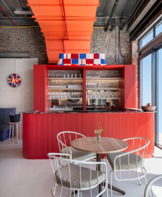
Injections of colour find their place against the juxtaposed industrial grittiness and the sleek white surfaces of the Corian workbenches and white epoxy flooring. “The basic functional spaces are left white to create a backdrop, almost like a gallery,” says Claudia. “The brand colours find their way into the space through the works of art and designer pieces.”
She commissioned bronze birds from Cape Town artist Jop Kunneke in the agency’s five brand colours: red, orange, green, pink-purple and turquoise. Perched on the railing of the second-floor mezzanine and the map room divider, the tongue-in-cheek birds add to the idea of a playground or park. Heath Nash and Paul Smith also mesh comfortably, as wallpaper inspired by the London designer and a multi-coloured Flower Ball light both reiterate the brand colours.
To further reinforce the playground theme, a sulky dog by Francois van Reenen sits alongside a sculptural Ron Arad rocking chair, and bright green AstroTurf on the balconies and a rusted park bench continue the theme. Additional plans include installing a slide between the first and ground floors, further adding to the playful nature of this creative office.
“This work space has brought our brand to life,” says Tabatha. “Our people are happy to come to work and are proud of the space – it just shows you the power of beauty.”
• Ongaro Interior & Furniture Design: 076 299 2314, info@ongaro.co.za
• Coley Porter Bell: 021 447 3270, www.cpbsa.com